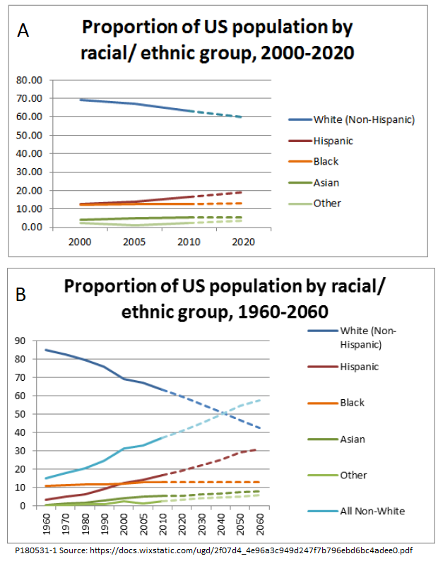
An article by Caitlin Dewey in the Washington Post led me to an interesting new piece of research by Rachel Wetts of U.C. Berkeley and Rob Willer of Stanford (unrestricted draft version here). The research, which is relevant for anyone in the area of public policy advocacy, shows how strongly framing—and the framing of charts, in particular—can affect attitudes toward pubic policies.
The specific issue that the authors investigate is the influence of information related to race on attitudes toward pubic assistance. As they put it in their abstract,
We argue that when whites perceive threats to their relative advantage in the racial status hierarchy, their resentment of minorities increases. This increased resentment in turn leads whites to withdraw support for welfare programs when they perceive these programs to primarily benefit minorities.
In one of several experiments, Wetts and Willer presented a questionnaire to a sample of participants recruited from Amazon Mechanical Turk. Before answering questions about welfare policy, participants were shown one of two variants of a chart depicting U.S population trends by race and ethnicity. Both charts were based on the same data from the Census Bureau, but Chart A shows a short time period, over which the trends appear relatively weak, while Chart B shows a longer time period, over which the trends appear stronger. Chart B also adds a line for “all nonwhite” which more dramatically shows that the white population is trending toward minority status.
After viewing the information, participants were presented with scenarios designed to reveal attitudes toward welfare. In one scenario,
participants were told to imagine that they were on a Congressional committee charged with cutting $500 million from the federal budget. They were given a list of nine spending areas including “Temporary Assistance for Needy Families (Welfare)” and asked to indicate how much they would cut from each area.
White participants said they would cut TANF by 28 percent if they had viewed Chart A and cut by 51 percent if they had viewed Chart B—a statistically significant difference.
Although there were too few minority participants to produce a statistically significant results, their answers provide some food for thought. The nonwhites who had viewed Chart A said they would cut TANF by 53 percent, while those who had viewed Chart B said they would cut by 57 percent. About three-quarters of the recipients of cash assistance programs are nonwhite. Does TANF look better from a distance than from up close, or is this a statistical fluke?
