Our hard-working and much-maligned mainstream media are doing a great job in providing easy-to-understand background on the tax reform debate.
On Wednesday, the Washington Post ran this fantastic image. This single graphic shows the distribution across the income spectrum of all the main personal income tax exemptions and deductions. But don’t look just at my static screen shot—check out the original with its interactive features.
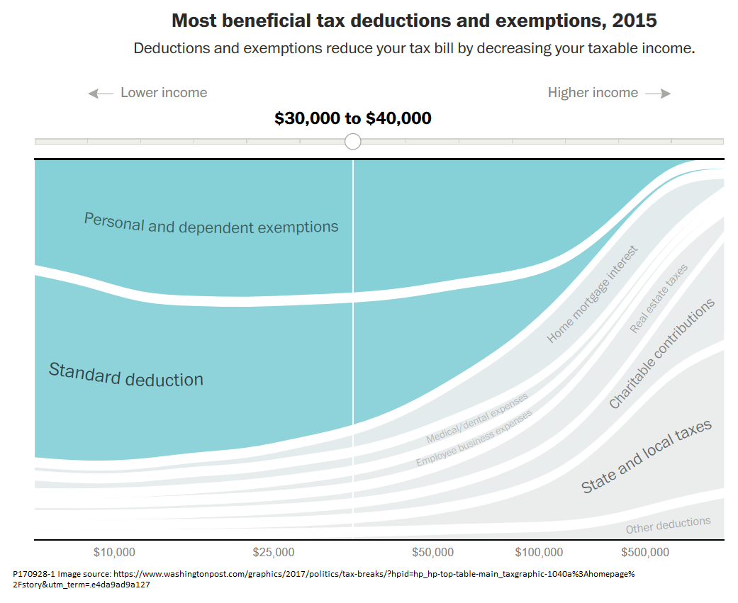
Earlier Niskanen Center posts treat two of the biggest deductions in detail. One discusses the mortgage interest deduction, which not only favors upper-income families (as the WaPo image shows) but violates standard principles of tax economics and serves no socially useful purpose. Another argues that the charitable deduction, which is also skewed toward the wealthy, does little to help the needy and brings in less than a dime of new charitable giving for each dollar cost to the federal budget. A third post presents the case for including expansion of child tax credits as an element of broader tax reform.
Missing from the diagram: preferential taxation of investment income and reform of the corporate tax. You can find information about these in another great set of tax-reform graphics from the New York Times.