
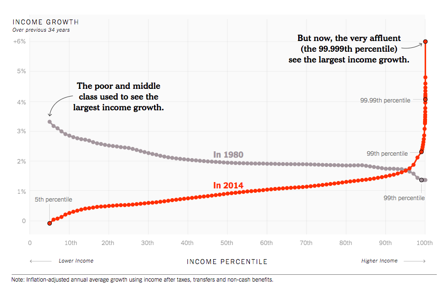
As an accompaniment to an elegant opinion post for the New York Times, David Leonhardt produced what became an instantly celebrated chart. It showed not only that the economic gains in the 34 years before 2014 were narrowly concentrated among the very highest earners, but that this stands in stark contrast to to the 34 years before 1980.
The underlying data comes from a paper by Thomas Piketty, Emmanuel Saez, and Gabriel Zucman. Like previous work by members of this team, the data handling effort is as ingenious as the conclusions are bracing. Leonhardt, for example, sees this as evidence of something deeply amiss in the way members of our society are rewarded. He writes:
In recent decades, by contrast, only very affluent families — those in roughly the top 1/40th of the income distribution — have received such large raises. Yes, the upper-middle class has done better than the middle class or the poor, but the huge gaps are between the super-rich and everyone else.
The basic problem is that most families used to receive something approaching their fair share of economic growth, and they don’t anymore.
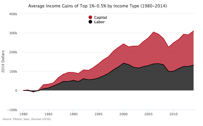
Matt Bruenig broke down the same data into capital income versus labor income
For him the takeaway was clear:
This data underscores the point made in Monday’s featured post: if we care about inequality, we must confront capital.
Capital Income is Different
This last chart got me thinking.
Capital income is a very different beast than labor income. In many cases it’s not clear that it goes to anyone, at least not in the same way that a weekly paycheck goes to most workers. For example, the three peaks after 1995 in Breunig’s chart bear a striking resemblance to the performance of the S&P 500 market index over the same period. Yet, high stock prices should be more properly thought of as lowering the return to capital, rather than raising it.
I’ve also had quibbles with Piketty in the past on how to think about and analyze capital and the distribution of the income from capital seemed to be playing a key role in generating these provocative conclusions. I had to get a clearer picture of what was happening beneath the surface.
Fortunately, Zucman’s personal website has a host of resources on the work he has done with Piketty and Saez. After scouring through two working papers, four paper-length data appendices, several enormous excel files, and powerpoint presentation the picture became a bit more clear.
Measuring the distribution of income, especially over time, is tricker than one might suppose. In principle, you need to know exactly how much income every individual in the economy received each year, going back decades. In practice, you want enough information on enough individuals overtime to statistically model the distribution with high confidence. The richest source of information on the income that individuals receive come from IRS records of tax filings.
Indeed, Piketty and Saez based their pioneering work on income inequality, on estimates they obtained from a sample of personal income returns. The problem is that a significant portion of capital income doesn’t show up on personal income tax returns. Capital income is return earned by investments in the economy. Yet, most individuals don’t invest directly. Instead investment is done on their behalf by corporations, insurance companies, pension plans and non-profit endowments. The largest direct investment that most people is their family home, which pays them back not income directly but in having a place to stay.
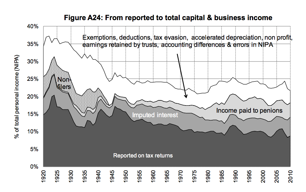
The following chart from Picketty, Saez and Zucman (PSZ) shows how large the gap is between capital income that gets reported on individual tax returns, and total capital income in the economy.
Of all the capital income in the U.S., only the portion represented by the darkest, bottom series on the graph shows up in tax returns. In recent years it’s represented a little less that half of total capital income. As you can also see it’s also been relatively flat in recent years. If anything there is a slight secular downtrend. So what’s going on?
The Rise of Defined Contribution Benefit Plans
Well, what has risen sharply since 1980 is capital income going to pensions. This a result both of the expansion of defined contribution pension plans such as 401(k)s and the rapid rise in equity prices over the last 30 years. The question is how to account for the capital income going to pensions in the distribution of income. This is no simple task conceptually or empirically and to do so Piketty, Saez, and Zucman have to make a series of heroic assumptions. I don’t fault them for this but the central to perhaps the accuracy and at minimum our interpretation of the growth in equality.
In particular, the authors first assume that 60 percent of defined contribution pension wealth is owned by current retirees and that 40 percent is owned by current workers in proportion to what their earnings. Its that latter part that is potentially important.
What makes defined contribution pensions attractive and what has largely driven their growing importance in capital income is the compounding of returns. Savings that one makes early in his or her life will grow over exponentially over time. Thus, one of the most important factors in determining the size of a person’s defined benefit pension is the length of time he or she has been contributing. However, the authors’ methods ignore that. Their analysis would assume that a corporate attorney in her first year out of law school would have a pension wealth 3 or 4 times the size of an office administrator who had been contributing for 30 years.
This assumption might not be that bad. If you assume, for example, that some corporate lawyers have been contributing for a long time and others for a short and that some office administrators have been doing the same, it could all wash out.
The problem is that wage inequality has been growing over time. Each year the difference between the income of the office administrator and the corporate attorney is higher than the year before. And so, each year the authors’ methods reweight the percentage of holdings ever towards the attorney even though the actual holdings are determined by historical investment.
Which is compounded by the fact that the size of the total size of defined benefit pensions is growing. The authors are automatically attributing an ever larger slice of an ever growing share of national income to current high income earners, even though actual holdings are determined by historical contributions.
Rising Stock Prices Aren’t the Same as Rising Income
All of that is related to how the authors calculate pension wealth. A further compounding problem is generated from the assumptions they make about income. They count any capital gains that are retained by pensions plans as income. In and of itself this assumption is reasonable, and accords with how economists usually think about income.
Yet, when combined with the distributional assumptions about wealth and current trends in equity prices, it has a perverse effect. Since the 1980s, equity prices have risen rapidly relative to historical norms. This has meant that the re-invested capital earnings of pensions funds have been particularly high. It’s unlikely that the growth rate can be sustained and indeed it already seems to be slowing.
This rapid appreciation actually cuts against the increase in inequality seen over the same period. It means that as high earners saw their salaries increase, they also so the effective price of saving for their retirement increase. Yet, Piketty, Saez, and Zucman’s method causes the increase in equity prices to exacerbate their measure of inequality.
These three effects, the weighting of defined contribution pensions wealth by current wages, the secular growth in the size of those pensions and the temporary acceleration in re-investment from 1980 to 2000 all interact with the increase in wage inequality over that same period to compound Piketty, Saez, and Zucman’s measure of inequality growth.
These interactions, I believe, are generating much of the hockey stick phenomenon. As wage inequality increased, high earners were automatically attributed an ever larger slice of a booming share of national income, and that increase in attribution itself was counted as an increase in their current income.
Take away these effects and, if I am right, the distribution of income growth would be spread more evenly among the top 10 percent. That’s a concern but it’s a different, perhaps even more insidious, kind of concern. It’s more about creeping rent-seeking of the type that Richard Reeves talks about in his book Dream Hoarders, than capitalism run amok.
—
Karl Smith is the Director of Economic Research at the Niskanen Center


